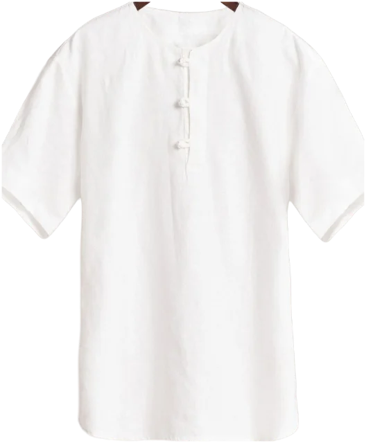
How to match colours in outfits: the colour wheel, made wearable
You don’t need a natural eye for colour, just a handful of rules that hold up on real clothes. Here’s how the colour wheel works when you’re getting dressed, and the pairings that never let you down.
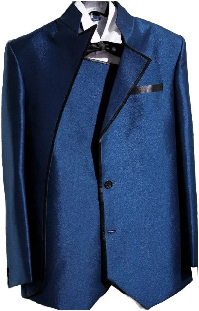
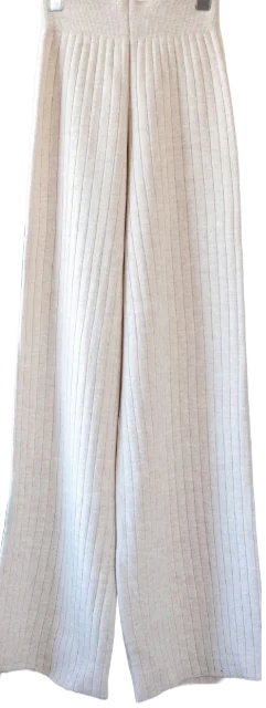
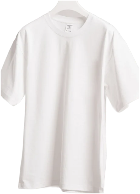
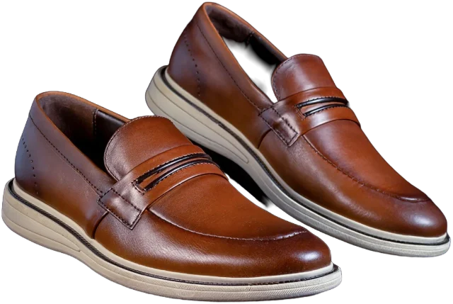
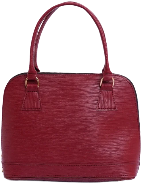
Wondering how to match colours in outfits? Build on two or three neutrals, such as navy, grey, cream, black, camel or denim, then add one accent colour. For more colour, choose shades that sit side by side on the colour wheel, or soften opposites into muted versions. Then vary how light and dark each piece is.
Key takeaways
- Build most outfits from two or three neutrals and add one accent colour.
- Tonal outfits work when you vary lightness and texture, not just the shade.
- Opposites on the colour wheel are bold; soften them into muted pairs such as olive and burgundy or navy and tan.
- Neighbours on the colour wheel are the easiest way to wear more than one bright colour.
- Most clashes come from near-misses, not from the colours themselves: match exactly or make the difference obvious.
That’s the short version. The rest of this guide explains why it works, so you can bend the rules on purpose rather than by accident.
The colour wheel, in plain English
Isaac Newton bent the rainbow into a circle in Opticks, first published in 1704, and people have been arguing about what to wear with what ever since. The wheel shows how colours relate: neighbours look calm together, opposites look lively.
Every colour you wear has three qualities worth noticing:
- Hue: the colour family itself, such as red, blue or green.
- Lightness: how close it sits to white or black. Pale pink and burgundy are both reds.
- Intensity: how vivid or greyed-down it is. Emerald is intense; sage is soft.
Most clashes aren’t really about hue. They happen when two pieces of the same lightness and intensity compete for attention, or when two colours are nearly, but not quite, the same.
Warm and cool
Colours also lean warm (towards yellow and red: camel, rust, olive, cream) or cool (towards blue: grey, navy, bright white, black). Warm with warm, or cool with cool, is the safe route. A warm colour next to a cool one reads as contrast, which is fine when you mean it.
Neighbouring colours also change each other. The 19th-century chemist Michel Eugène Chevreul built a whole theory of colour contrast on this, and the English edition of his book lists dress and military clothing among its uses. It’s why the same grey jumper looks warm next to camel and cold next to black.
Start with neutrals plus one accent
If you remember one formula, make it this one. Neutrals do the structural work and the accent gives the eye somewhere to land. It suits every budget, every style and every dress code.
- Pick two neutrals for the biggest pieces: trousers, coat or jacket.
- Add a lighter or darker neutral near your face, such as a tee, shirt or knit.
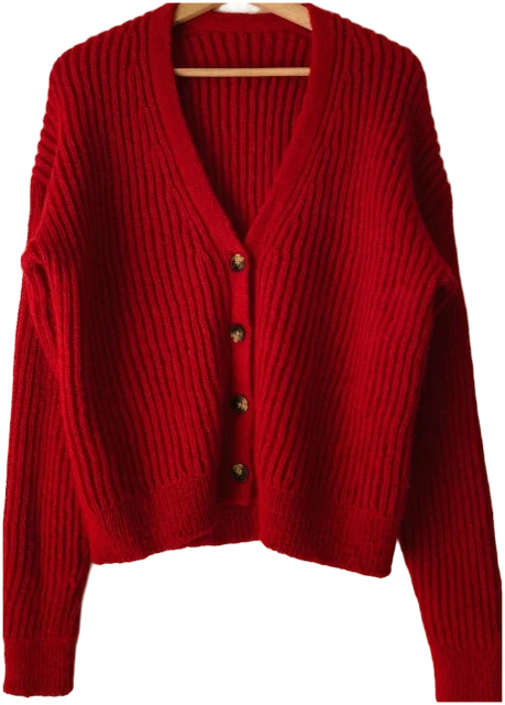
- Choose one accent: a red cardigan, a burgundy bag, a green scarf.
- If you like, repeat the accent once in a smaller dose so it looks planned.
A rough split many stylists use is 60/30/10: about 60% main colour, 30% second colour and 10% accent. You don’t need a tape measure. It just means one colour clearly leads.
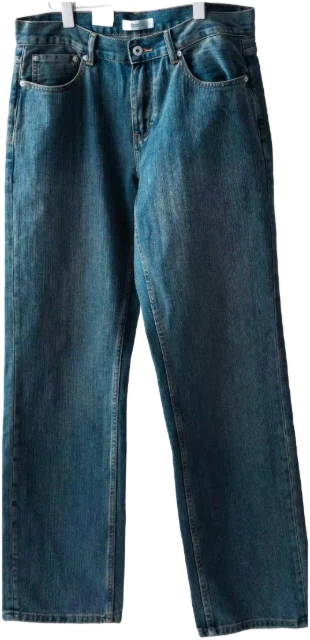
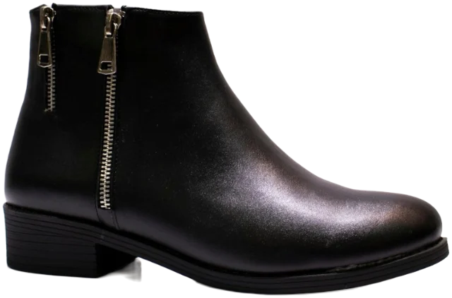
Blue is the honorary neutral. In a YouGov survey, blue was Britain’s favourite colour, picked by 33% of people. Handy, because navy and denim behave like neutrals and go with almost everything. If you want to go further with a calm base, our guide to a neutral wardrobe that isn’t boring picks up where this section stops.
Tonal and monochrome dressing
Tonal dressing means wearing one colour family from head to toe in different shades: cream, oatmeal, camel and chocolate, say. Monochrome is stricter, using a single colour throughout. Both look long, calm and quietly expensive, even with inexpensive pieces.
The secret is variation inside the family:
- Vary lightness by a few clear steps. Cream trousers, a camel coat and a chocolate knit work; three almost-identical beiges look like an accident.
- Vary texture. Knit against leather against cotton gives a single colour depth.
- Keep the undertone. Warm creams go with warm browns; cool greys go with bright white.
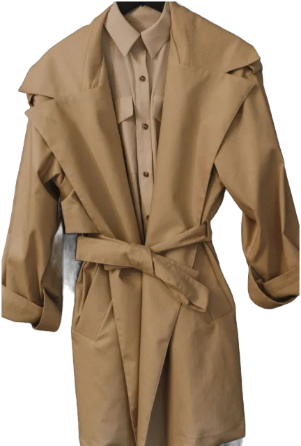
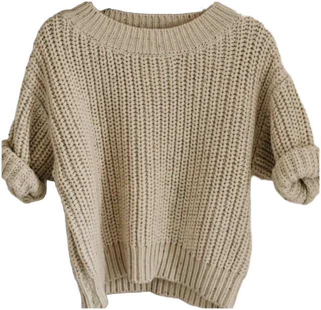
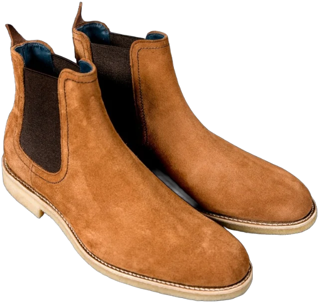
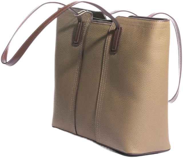
Tonal works in cool shades too: charcoal with pale grey, or navy with a pale blue shirt. Black on black works when the fabrics differ, wool with leather or cotton, so it reads as a choice rather than a uniform.
Complementary, analogous and other pairings
Complementary: opposites that energise
Complementary colours sit opposite each other on the wheel: red and green, blue and orange, yellow and violet. Tate describes them as the pairs that contrast more than any others, and notes that they make each other look brighter side by side. That’s exactly why a full-strength pair can look like a football kit.
Two ways to make opposites wearable:
- Let one lead. A navy coat with a rust scarf is elegant. Navy and orange in equal halves is a lot.
- Mute both. Olive and burgundy are green and red turned down. Navy and tan are blue and orange in their Sunday best.
Analogous: neighbours that blend
Analogous colours sit side by side on the wheel: blue, teal and green; red, rust and orange; pink, coral and red. They share a parent colour, so they get along even at full strength. This is the easiest way to wear more than one bright colour at once.
Try a green jumper with teal trousers, or a rust shirt with a mustard scarf and brown boots. Keep the rest neutral and the outfit looks considered rather than loud.
Triadic and split complementary
A triadic scheme uses three colours evenly spaced around the wheel, such as red, yellow and blue. It’s bold, so mute at least one of them. A split complementary uses one colour plus the two neighbours of its opposite: blue denim with a rust jumper and a mustard scarf is a wearable example.
Colour combinations for clothes that always work
When you’re standing at the closet in a hurry, start here. Find your main piece in the first column, then pick from the second.
| Main colour | Pairs well with | Try |
|---|---|---|
| Navy | White, cream, camel, grey, burgundy, pale blue | Navy blazer, white tee, cream trousers |
| Black | White, grey, camel, red, cream | Black dress under a camel coat |
| Grey | Navy, white, burgundy, pink, black | Grey knit over a white shirt, navy trousers |
| Camel and beige | White, navy, black, chocolate, olive | Camel coat, white tee, dark jeans |
| Cream and white | Almost anything, especially navy, brown and olive | Cream trousers with a chocolate knit |
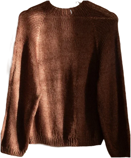
| Brown and chocolate | Cream, denim, olive, pale blue, pink | Chocolate jumper, dark jeans, tan boots |
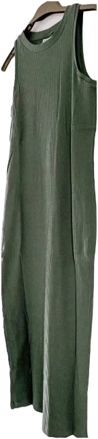
| Olive | Cream, camel, burgundy, rust, navy | Olive dress, camel coat, burgundy bag |
| Burgundy | Navy, grey, camel, olive, pink | Burgundy knit with grey trousers |
| Denim blue | White, grey, camel, red, rust, brown | Jeans, white shirt, red cardigan |
| Red | Navy, white, denim, camel, black | Red knit, navy trousers, white trainers |
| Pink | Grey, navy, red, olive, burgundy | Pale pink shirt under a grey jumper |
| Bright green | Navy, cream, pink, blue | Green jumper with cream trousers |
What colours shouldn’t you wear together?
Fewer than you’ve been told. Old rules banned black with navy and brown with black, and both can look sharp. The real culprits are subtler:
- Near-misses. Two navies or two blacks that almost match look like a mistake. Match exactly, or make the difference obvious.
- Two loud colours at the same size. Lime trousers and a hot-pink top fight for the spotlight. Shrink one to a scarf or a bag.
- Mixed undertones in a tonal look. Bright white next to warm cream can make the cream look grubby.
- Too many accents. Three statement colours plus a print leaves the eye nowhere to rest.
Prints follow the same logic. Pick one colour out of the print and repeat it in a plain piece; our guide on how to mix patterns covers what to do when you want two prints at once.
Shoes, belts and bags
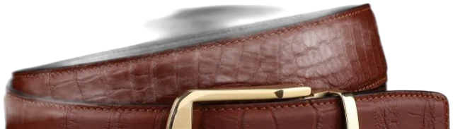
Your leathers don’t need to match exactly any more, but they should look related. Keep them in one family, all browns or all blacks, or make one the deliberate odd one out, like a burgundy bag with brown shoes. Brown and black in the same outfit works when each appears at least twice, not when one wanders in alone.
Shoes can also bridge an outfit. Tan boots pull a camel coat and dark jeans together; black boots ground a bright top.
How to find the colours that suit you
Which colours go together and which colours suit you are different questions. For the second, contrast is more useful than strict rules.
- Look at your own contrast. If your hair, skin and eyes contrast strongly, crisp pairs like black and white tend to look natural on you. If they’re closer in depth, softer pairs like cream and camel often look easier.
- Test near your face in daylight. Hold the piece under your chin by a window. Shop lighting flatters everything and tells you nothing.
- Notice compliments. When people say “that suits you”, it’s usually the colour, not the cut.
Seasonal colour analysis can be a helpful shortcut, but treat it as a starting point rather than a verdict. A colour you love and wear beats a “correct” one that never leaves the hanger. If you’re still working out what you like, start with finding your personal style.
A quick colour check before you leave the house
- Can you name the outfit’s main colour in one word?
- Is there one accent, or one family of accents?
- Is there contrast in lightness somewhere, like a light top over darker trousers?
- Do your shoes, belt and bag belong together, or is one the odd one out on purpose?
- Does anything nearly, but not quite, match?
Colour through the seasons
The time of year changes what looks right. In autumn and winter, deeper shades such as burgundy, olive, chocolate and navy sit naturally with heavier fabrics. In spring and summer, lighter neutrals like cream and stone, plus clearer colours, feel fresher. On a grey British day, mid-tones are the safe bet: pastels can look washed out and very dark outfits heavy.
Occasions shift the dial. At work, quieter colours with one accent read as polished, which is most of what a smart casual dress code asks. At weddings, colour helps you look celebratory, as long as you steer clear of white and cream; our guide to wedding guest dress codes has the rest. And on a first date, wear the colour people compliment you in, then read what to wear on a first date for the rest of the outfit.
Questions
Can you wear black and navy together?
Yes. It looks deliberate when the contrast is clear, such as a navy blazer over a black tee or black trousers with a navy knit. It only goes wrong when the two are so close in shade that they look like a suit that’s lost its other half.
Do brown and black go together?
They do, especially when one clearly leads and the other appears more than once, for example black trousers and a black top with brown boots and a brown belt. Deep chocolate browns sit with black more easily than orangey tans.
What is the three-colour rule in fashion?
It’s a rule of thumb that says to keep an outfit to about three colours, counting neutrals. Treat it as a starting point: denim and very quiet neutrals rarely feel like they count towards the total.
What colour goes with everything?
No single colour does, but navy, white, cream, grey and mid-blue denim come closest, because they sit comfortably next to both warm and cool shades.
Sources
- Complementary colours (Art term), Tate
- Opticks: or, A treatise of the reflections, refractions, inflections and colours of light, Isaac Newton, via Project Gutenberg
- The laws of contrast of colour: and their application to the arts, M. E. Chevreul, via Project Gutenberg
- Why is blue the world’s favourite colour?, YouGov